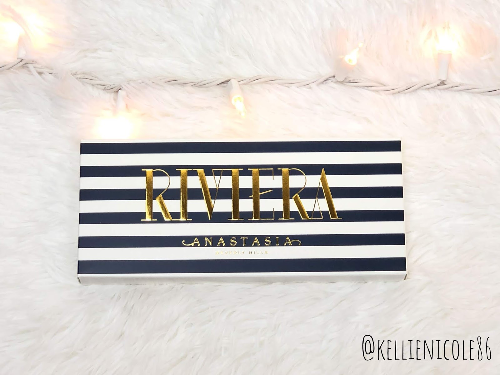
Hey guys! For today's blog post we are going to be talking about the new Riviera Eyeshadow Palette from Anastasia Beverly Hills. I will be including swatches, what I would change, and a few makeup looks I created using this palette!

Before we start this review. lets get into some of the details! This is a half colorful, half neutral 14 pan palette. It contains 5 mattes, 4 metallics, 2 duo chromes, and 3 pressed pigments! It also comes with a dual sided brush and mirror - retailing for $45 at Sephora, Ulta, and the ABH website!
Now for my personal makeup taste, I absolutely love this idea! I enjoy working with colors so much, but Anastasia - like many other popular beauty brands - tend to stay away from colorful palettes. I feel like this is a very safe way for brands to dip their toes into color - there's color for those that prefer, but there's also some neutrals for those that like to play it safe.

The traditional matte shades as well as the shimmers and duo chromes are the typical ABH formula that we have grown to know and love! They are creamy, pigmented, blendable - and very powdery! Fallout city for a lot of these shades, so I always recommend doing your eyeshadow first when working with Anastasia shadows.

Now the pressed pigment formula is new to ABH, and honestly, it shows! The three pigments are shown in the swatches above - Bahama [the bright pink], Cannes [the vibrant purple], and Palm [the rich brown].
 |
| Shades Used: Bahamas, Cannes, Monte Carlo, Seaside, Mediterranean, Seychelles, Estate, Sails |
So far Bahama has not given me any issues! It's been pigmented, smooth, fairly blendable, but BOY DOES IT STAIN! My hand had a strip of pink on it for three days after taking pictures of the swatches!
 |
| Shades Used: Cabana, Cannes, Inheritance, Sails |
Cannes is pretty tricky to work with, I'm not going to lie. It goes on quite patchy and uneven - I couldn't even get both eyes to match properly! If you look closely at the picture above, my left eye has less pigment than my right. I tried to build it up the best I could, but for some reason it just did not want to stay on my lid. It also did not blend as well as I would like, and overall I was just a little disappointed. However, I know that purples are some of the hardest shades to formulate, so I am keeping that in mind. It's not the absolute worst purple I have used by any means, but it is definitely not the best. This shade does stain for a bit, but not nearly as bad as Bahama does!
 |
Lastly, let's talk about Palm. Honestly, this was the worst shade in the palette, in my personal opinion. As you can see from the picture above - it's incredibly patch, hard to blend, it doesn't go on evenly, doesn't build up well - overall, just an extremely difficult shade to work with. If you look closely after it is applied, you can see a slight purple undertone, which may be why it is so hard to work with. I appreciate that they wanted to make the typical rich brown a little more interesting and cohesive with the rest of the palette, but unfortunately it is a miss. This shade doesn't stain at all, just for the record!
 |
| Shades Used: Cabana, Coastline, Monte Carlo, Palm, Yacht, Sails, Palermo [Lower Lash Line] |
What I Would Change:
I would of course fix the patchiness, inability to build, etc mentioned above with Cannes [vibrant matte purple]. Aside from that, I would also change out some of the shades in order for the palette to flow a bit more cohesively, in my personal opinion! I would switch out Palm [matte rich brown shade] for a matte navy blue, one similar to the outer packaging. I feel like this would go much better with the color scheme, still provide a matte deep shade for us to work with, and would mesh better with the other shades. Since Estate and Coastline are honestly pretty similar, I would also replace Estate [matte orange-cream shade] for a matte lavender. This would allow the more purple looks to have a corresponding transition shade. Lastly, I would swap Yacht [duo chrome taupe shade] for a lighter shimmer or duo chrome - a pink, purple, or even blue. This would help lighten the palette a bit, give it more of a spring vibe. It would provide a light shadow to put in the inner corner or even the inner part of the lid to help open the eyes and make everything look less dense.
Overall, my final review is this - even though I had two shades that gave me a good deal of trouble, I still whole heartedly enjoy this palette. Every time I look at it, I get so incredibly inspired and immediately think of tons of ways to use these shades! The packaging is beautiful and it doesn't get dirty like the other ABH palettes [thank goodness!]. I love the entire theme of the collection and the aesthetic that it brings to the table.
In all honesty, the rich brown Palm shade is the one shade that I never really want to reach for, so the fact that it is the worst in the palette isn't the most heartbreaking for me! With that in mind, I would rate this palette a solid 4/5!
Have you guys picked up this palette? What do you think about it? If not, are you interested in picking it up? I'm curious to hear your opinions! I hope you enjoyed my thoughts on the new ABH Riviera palette and consider sticking around, I'd love for us to be friends ☺️ Thank you guys so much for taking the time out of your day to read this blog post, it truly means the world to me!
Have an amazing day everyone 😊
- Kell 💜
kellienicole86
Okay okay, so I read blogs now :-) ;-). Turns out you can do that quit easily at work, but keep that between us, okay.
ReplyDeleteAll jokes aside, lovely post Kellie. I like how you mention what you would change to make it perfect for you, and you made some great points!
I feel so special that you decided to read my post! You're the sweetest 😊 Thank you for your kind words and thoughts!
DeleteFirst, I loved the looks you featured on IG (and in this post) that were created with this palette. Second, I like how you really shared your honest thoughts on this palette! Sometimes I think bigger YouTubers or influencers review products when the hype and first-impression haze is still too strong (which can lead to overly glowing reviews). I still have yet to crack my Riveria palette open to create some looks, but I'm glad to have the warnings regarding the patchiness of certain colors.
ReplyDeleteThank you so much! I agree, it seems that hype can alter someone's review, whether they realize it or not. It's so easy to get caught up in this community.
DeleteHey! I reviewed the palette a couple of weeks ago and I totally agree with all your points!
ReplyDeleteThe mattes and shimmers are great as usual, but the pressed pigments are difficult to work with, especially Cannes and Palm. Bahamas seems easier, but yeah it stains like hell. I even struggled to remove the swatches on my arms lol
I'm madly in love with the gold shimmer, I want to bathe in it.
Great review and I love the yellow/purple look!
Thank you so much for reading and your kind words! I would love to read/watch your review 😊 please comment it below so I can return the support!
Delete